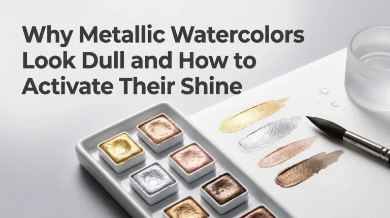
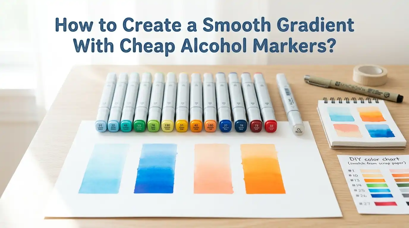
How to Create a Smooth Gradient With Cheap Alcohol Markers?
Cheap alcohol markers can still make soft and beautiful gradients. You do not need a luxury set to get a clean blend. You need the right order, the right paper, and a simple method you can repeat.
Many beginners blame the marker first. Sometimes the marker is the problem. But in many cases, the real issue is dry timing, poor paper, wide color gaps, or heavy pressure. The good news is that all of those problems have clear fixes.
In this guide, you will learn practical steps that help cheap markers work better. You will also learn when a method helps and when it makes the blend worse. If your gradients look streaky, patchy, or harsh, this post will help you fix that fast.
Key Takeaways
- Pick colors that sit close together. Cheap alcohol markers struggle when you force a big jump from light to dark. A light, a mid tone, and a dark tone give you a much softer result. Close colors blend better because the transition is smaller.
- Use smooth paper made for markers or very smooth Bristol. Rough paper grabs ink too fast. That creates hard edges and streaks. Smooth paper keeps the ink near the surface for a little longer, so you have time to blend. Paper matters more than many beginners expect.
- Work while the ink is still damp. Alcohol ink blends best before it fully dries. If you wait too long, you get bands instead of a gradient. That does not mean you must rush. It means you should color in a small area, then blend it right away. Small sections are easier to control.
- Go back with the lighter marker. This is one of the easiest fixes for harsh edges. Lay down the light color first, add the darker color, then return with the light marker to soften the meeting line. This simple loop works well even with low cost markers.
- Do not depend on the colorless blender for every job. It can help in some cases, but it does not replace smart color choice and good layering. Sometimes it pushes ink around in a useful way. Sometimes it creates a pale patch. Use it as a tool, not as a magic fix.
- Practice one method at a time. Cheap markers can still produce smooth results, but they need a steady hand and clear steps. Start with small swatches, test your marker order, and learn how wet your markers stay. Consistency beats speed every time.
Why Cheap Alcohol Markers Often Look Streaky
Cheap alcohol markers often have uneven ink flow. One marker may feel juicy, while another feels dry. That alone can break a smooth gradient. The nib can also be rougher, which makes the strokes more visible on paper. This is why cheap sets can feel random from color to color.
Paper makes the problem bigger. If the sheet is too absorbent, the ink sinks fast and leaves sharp lines. If your colors are far apart, the transition looks harsh even when your hand is steady. Most streaks come from a mix of marker quality, paper choice, and timing.
The upside is simple. You can still get good results if you lower the stress on the marker. Work in smaller shapes. Use closer shades. Blend before the edge dries. Cheap markers do best when you ask less from each stroke. Once you know that, your results improve fast.
Choose the Right Color Family Before You Start
The smoothest gradient starts before the first stroke. You need colors that belong together. A pale blue, a medium blue, and a dark blue will blend better than a pale blue and a dark navy alone. The closer the shades, the easier the transition.
If your set has limited options, stay inside one color family first. Do not jump between colors that fight each other. Yellow into purple, for example, can turn dull if you do not add bridge colors between them. Analogous colors usually behave better than opposite colors.
Pros: close shades make blending easier, reduce muddy color, and save time.
Cons: cheap sets may not offer perfect color spacing, and some shades may dry a little different from the cap.
A good rule is this. If two markers already look very different in a swatch box, they may need a third marker between them. That extra step often changes everything.
Use Paper That Gives You More Blending Time
Good paper can make cheap markers feel better. Bad paper can make good markers feel weak. Smooth marker paper and smooth Bristol are the safest choices for gradients. They keep the ink from sinking too fast, which gives you a little more time to push colors together.
Regular printer paper is usually a poor choice. It feathers, bleeds, and dries in a rough way. Very textured paper is also hard to blend on because the nib skips over the surface. Smooth paper helps the ink move in a more even way.
Pros of marker paper: very smooth surface, easy blending, less visible stroke texture.
Cons of marker paper: often thin, can bleed through, and may not handle mixed media well.
Pros of smooth Bristol: sturdy surface, bright color, and better control.
Cons of smooth Bristol: some brands are less blend friendly than others, so testing matters.
If your blends always fail on one paper, test a new sheet before blaming the marker.
Swatch First So the Marker Does Not Surprise You
Swatching saves time, ink, and frustration. Cheap alcohol markers often look different on paper than they look on the cap. A marker that seems light may dry darker. Another may be much warmer than expected. A quick swatch chart gives you the truth before you start your art.
Make a simple page with small boxes. Test each marker alone, then test likely pairs and trios. Watch how they meet at the edge. Watch how fast they dry. This tells you which markers actually behave like blending partners.
Swatching also helps you find weak spots in the set. You may notice that your greens blend well but your reds jump too fast. That is useful. Now you know where to use a gentle touch and where to add extra layers.
Pros: better color planning, fewer mistakes, smoother gradients.
Cons: it takes setup time, and some people skip it because it feels boring.
Still, five minutes of swatching can save an hour of fixing bad blends.
Start With the Basic Two Color Blend
The easiest method for cheap markers is the two color blend. First, fill the area with the lighter marker. While that area is still damp, add the darker marker where you want the shadow. Then go back with the lighter marker and gently pass over the meeting line. This softens the edge and creates a simple gradient.
Keep the area small at first. A leaf, petal, or small sphere is perfect. If the shape is too large, the first layer may dry before you finish. That creates bands. Small spaces let you learn timing without panic.
Pros: simple, fast, and easy for beginners to repeat.
Cons: the transition may still look rough if the two colors are far apart.
Use light pressure. Heavy pressure puts down too much ink in one place. That can cause a wet patch instead of a clean blend. When the result looks harsh, do not scrub. Just repeat the light to dark to light cycle once more.
Use a Three Color Blend for Softer Results
A three color blend is often the best answer for cheap alcohol markers. Use a light shade, a mid tone, and a dark shade. Start with the light shade over the whole area. Add the mid tone in the middle or shadow zone. Add the dark shade in the deepest shadow. Then return with the mid tone, then the light tone, to soften each edge.
This method works because the jump between colors is smaller. Smaller jumps create smoother gradients. Even if your markers are not premium quality, a mid tone can hide a lot of roughness.
Pros: softer blend, better depth, easier shading control.
Cons: uses more markers, takes more time, and some cheap sets do not have a perfect middle shade.
If you can only learn one method, learn this one. It gives you the best chance of success with low cost supplies. It also helps your coloring look more polished without making the steps hard.
Try Feathering for Hair, Petals, and Fur
Feathering means you pull strokes into each other with a flicking motion. Start from one side with the first color. Let the stroke lift as it moves inward. Then come from the other side with the second color and let the tips overlap. The overlap zone becomes the blend.
This method works well for shapes with direction. Hair strands, flower petals, fur, and fabric folds all benefit from feathering because the strokes look natural inside those forms. The motion itself becomes part of the texture.
Pros: good for directional subjects, adds texture, works well with brush nibs.
Cons: less useful for flat backgrounds, and shaky flicks can look messy.
Do not make every stroke the same length. A little variation helps the result look softer. Keep your wrist relaxed. If the overlap line looks sharp, add a light pass with the middle or lighter color. That usually smooths it enough.
Use a Colorless Blender With Care
A colorless blender can help, but it is easy to misuse. It does not always blend two colors in a smooth way by itself. In many cases, it pushes pigment away or lightens an area. That can be useful for soft edges, tiny highlights, or pulling color outward. It is better for adjustment than for full blending.
Try the blender after you already have two colors on the page. Touch the hard edge lightly and see how the ink moves. If the paper gets too wet, stop. Cheap markers and cheap paper can react badly to too much solvent. More is not better here.
Pros: good for softening tiny edges, lifting color, and adding texture effects.
Cons: can leave pale blooms, can oversaturate paper, and may create more mess than help.
For many gradients, a light marker does a better job than the blender. The lighter marker keeps the color family intact. The blender can break that harmony if you overuse it.
Layer in Small Passes Instead of Flooding the Area
Beginners often try to get a gradient in one heavy pass. Cheap markers usually dislike that. A better method is controlled layering. Put down a light base. Add a small shadow layer. Blend the edge. Let it settle for a moment. Then deepen the shadow only where needed. Thin layers give you more control than a soaked area.
This method also helps when one marker in the set is much wetter than the others. If you flood the paper, that wet marker can overpower the whole blend. Small passes keep each color in balance.
Pros: more control, easier to fix, less blotching.
Cons: slower process, and impatient artists may stop too soon.
Watch the page after each pass. Alcohol ink often looks worse for a few seconds before it settles. Do not chase every line right away. Sometimes the blend smooths out on its own. A calm pause can save your paper.
Control the Edge With Stroke Direction and Nib Choice
Stroke direction changes the look of the gradient. If you move in random directions, the blend can look patchy. If you follow the shape, the gradient looks cleaner. On a round object, curve your strokes around the form. On a petal, move from base to tip. The stroke should support the object.
Nib choice also matters. A brush nib usually gives a softer edge and more control in small areas. A chisel nib covers space fast and can work on backgrounds. Use the nib that matches the job, not just the nib you like most.
Pros of brush nib: soft strokes, better control, easier feathering.
Cons of brush nib: slower coverage, softer tips wear down.
Pros of chisel nib: fast fills, broad coverage, useful on large shapes.
Cons of chisel nib: more visible edges in small spaces, harder to control for detail.
When a gradient looks rough, check your stroke path. The issue may be the motion, not the marker.
Fix Harsh Lines, Bleeding, and Patchy Spots
Most alcohol marker problems can be improved, even if they cannot be erased. If you see a harsh line, go back with the lighter marker and smooth only the edge. If the shadow is too weak, deepen the darkest part only. If the area looks patchy, add a very light full pass with the base color to unify it.
Bleeding outside the line is harder. Let it dry first. Then see if a darker outline or nearby shadow can hide it. Trying to fix wet bleeding right away often makes it spread more.
For blotchy areas, ask what caused them. Too much ink, bad paper, dry nib, or rough pressure are common causes. Fixing the habit matters more than fixing the one spot.
A smart artist keeps a test sheet nearby. Before you correct the real drawing, test the move on scrap paper. That one habit prevents many second mistakes.
Practice With Simple Shapes Before Full Illustrations
If you want smoother gradients fast, practice on circles, strips, leaves, and petals before you color a full page. Simple shapes remove extra stress. You can focus on blending, not on design choices. This is the fastest way to build control.
Make a short practice plan. Blend one blue strip with two colors. Blend one green leaf with three colors. Feather one petal. Test one blender correction. In a single session, you will learn more than you learn from forcing one large picture to work.
Pros: fast learning, clear feedback, low pressure, easy comparison.
Cons: it can feel repetitive, and some people skip it because they want finished art.
Still, practice pages build real skill. Keep them in a folder. After a week or two, compare the first page to the latest page. You will see cleaner edges, better timing, and stronger confidence. That proof keeps you going.
Build a Simple Routine for Better Gradients Every Time
A smooth gradient comes from routine more than luck. First, swatch the colors. Second, test them on the paper you plan to use. Third, choose a method that fits the shape. Fourth, work in small areas. Fifth, blend light to dark to light, or use three tones if the jump is wide. A repeatable routine removes guesswork.
Cheap alcohol markers become easier to use when you treat them in a consistent way. You learn which colors dry fast. You learn which nib feels rough. You learn how much paper the set can handle. That knowledge matters more than brand price.
Keep your process simple. Good paper, close colors, small sections, light pressure, and patient layering solve most problems. If your first attempt still looks streaky, do not quit. One small change, such as better paper or one middle shade, can make a huge difference.
FAQs
Can cheap alcohol markers really make smooth gradients?
Yes, they can. The result may not look as polished as a premium set, but smooth gradients are still possible. Use close colors, smooth paper, and small sections. Technique can improve cheap markers a lot.
Is a colorless blender necessary?
No. It can help in some situations, but it is not required. A light marker often blends edges more naturally. Think of the blender as an extra tool, not the main tool.
Why do my gradients look worse on large areas?
Large areas dry before you can finish blending. That creates bands and streaks. Break the space into smaller parts or use a chisel nib with fast, even passes.
What is the best beginner method to learn first?
Start with the three color blend. It is forgiving and gives a softer transition. Once that feels easy, try feathering and controlled layering for more texture and depth.

Hi, I’m Zoe Ward, the creator and voice behind Fine Brush Vault. I’m passionate about art, painting, and exploring the world of colors. I spend my time testing and reviewing art supplies to help fellow creators find the best tools for their craft. Through honest reviews and detailed guides, my goal is to make your creative journey easier and more inspiring.