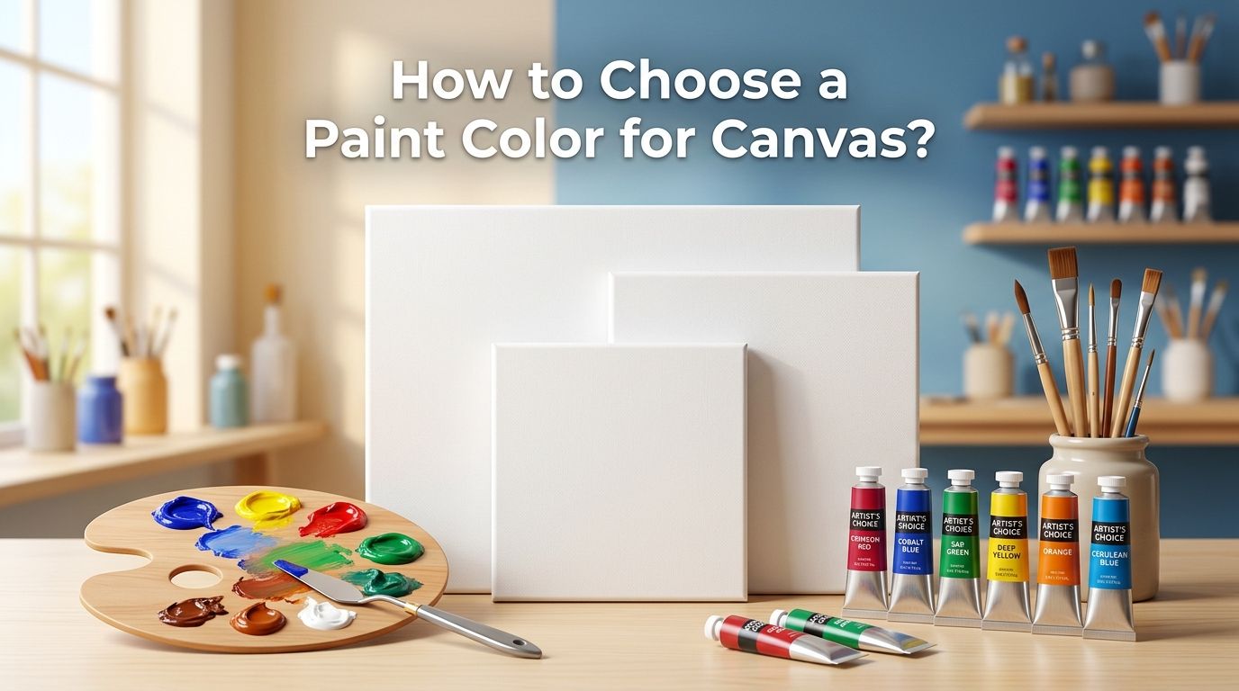
How to Choose a Paint Color for Canvas? Step by Step Guide
Standing in front of a blank canvas can feel exciting and overwhelming at the same time. You have brushes ready, inspiration flowing, but one question stops you cold: what color should you actually use?
Choosing the right paint color for your canvas is one of the most important decisions you will make before a single brushstroke lands. The wrong choice can make your painting look muddy, flat, or disconnected. The right choice brings your entire piece together with harmony and impact.
Whether you are a beginner holding your first tube of acrylic or a seasoned painter looking for fresh direction, this guide will walk you through every step.
In a Nutshell
- Start with the basics of color theory. The color wheel is your best friend. Understanding primary, secondary, and tertiary colors gives you the foundation to pick any color with confidence. You do not need a degree in art to grasp these simple relationships.
- Choose a limited palette first. Working with just four to six colors forces you to learn how paints mix and interact. A limited palette creates natural harmony in your painting and prevents the “too many colors” problem that makes artwork look chaotic.
- Consider toning your canvas before painting. A toned canvas, meaning one coated in a light wash of color before you begin, helps you judge values and colors more accurately. This simple step can improve your final result dramatically.
- Match your palette to the mood and subject of your piece. Warm colors like reds and oranges evoke energy. Cool colors like blues and greens create calm. Your color choices should serve the emotional story of your painting.
- Test your colors before committing. Always swatch your paints on a scrap piece of canvas or paper. Colors look different wet vs. dry, and what appears perfect in the tube may surprise you on the surface.
- Do not be afraid to adjust as you go. Painting is a process. Even experienced artists shift their color choices mid painting. Trust your eye and stay flexible.
How to Understand Color Theory Before You Pick Your Canvas Colors
Color theory is the foundation of every good painting. It explains how colors relate to each other and how they create visual effects together. The color wheel organizes colors into three groups: primary (red, blue, yellow), secondary (green, orange, purple), and tertiary (mixtures of primary and secondary).
Complementary colors sit across from each other on the wheel. Red and green are complementary. Blue and orange are complementary. These pairs create strong visual contrast and make each other pop on canvas.
Analogous colors sit next to each other on the wheel. Blue, blue green, and green are analogous. They create smooth, peaceful transitions and work well for subtle paintings. You should spend a few minutes studying the color wheel before you buy any paint. This small investment of time saves you from frustration later.
How to Decide Between Warm and Cool Colors for Your Painting
Every color falls into a warm or cool category. Warm colors include reds, oranges, and yellows. They push forward visually and create feelings of energy, passion, and excitement. Cool colors include blues, greens, and purples. They recede visually and create calm, depth, and serenity.
Your subject matter should guide this decision. A sunset beach scene calls for warm oranges and pinks. A snowy mountain landscape needs cool blues and grays. Mixing warm and cool colors in the same painting creates depth and visual interest. Place warm tones in the foreground and cool tones in the background to create a natural sense of distance.
Pros of warm dominant palettes: High energy, eye catching, great for bold subjects.
Cons of warm dominant palettes: Can feel overwhelming if not balanced with some cool tones.
Pros of cool dominant palettes: Calming, sophisticated, great for moody pieces.
Cons of cool dominant palettes: Can feel flat or lifeless without some warm accents.
How to Build a Limited Color Palette That Works Every Time
A limited palette means using only four to six paint colors to create your entire painting. This sounds restrictive, but it actually frees you up creatively. You learn to mix a wide range of shades from a small set, and your painting naturally looks unified.
A classic limited palette includes: titanium white, cadmium yellow, cadmium red, ultramarine blue, and burnt umber. From these five colors, you can mix almost any shade you need. Many professional artists rely on a limited palette for every piece they create.
Pros of a limited palette: Better color harmony, faster decision making, lower cost, and stronger mixing skills over time.
Cons of a limited palette: You cannot achieve every possible hue, and some vivid colors like bright violet require additional tubes.
Start with this approach if you are a beginner. You will develop your eye faster and avoid the trap of buying dozens of colors you rarely use.
How to Choose Between Acrylic, Oil, and Watercolor for Your Canvas
Your paint type affects your color choices significantly. Acrylic paint dries quickly, is water soluble, and works on almost any surface. Colors shift slightly darker as acrylics dry, so you need to account for that when choosing shades.
Oil paint dries slowly, blends beautifully, and maintains its color from wet to dry. It gives you more time to adjust and mix on the canvas. However, oils require solvents for cleanup and have a longer drying period.
Watercolor is transparent and luminous. It works best on paper or watercolor canvas. Colors appear lighter as they dry. Watercolor rewards a delicate, layered approach.
Pros of acrylics: Fast drying, easy cleanup, versatile, affordable.
Cons of acrylics: Color shift when drying, less blending time.
Pros of oils: Rich color, long working time, smooth blending.
Cons of oils: Slow drying, requires solvents, higher cost.
Choose your paint type based on your working style and subject matter. Then select colors within that medium.
How to Tone Your Canvas for Better Color Results
Toning means covering your blank white canvas with a thin wash of color before you start painting. A toned canvas removes the harsh white surface and gives you a middle value to work from. This makes it easier to judge how light and dark your colors should be.
Common toning colors include burnt sienna, yellow ochre, and neutral gray. Burnt sienna is popular because it provides a warm mid tone that works with most subjects. Yellow ochre is excellent for landscapes. Neutral gray is ideal if you want to avoid color bias.
To tone your canvas, thin your paint with water (for acrylics) or medium (for oils). Apply a thin, even layer across the whole surface. Let it dry completely before you begin painting.
Pros of toning: Better value judgment, unified undertone, less intimidating starting surface.
Cons of toning: Adds prep time, can influence final colors if applied too thickly, and may dull very light or bright paintings.
How to Use a Color Wheel to Pick Complementary and Analogous Schemes
A color scheme is a planned combination of colors that work together. The two easiest schemes for painters are complementary and analogous.
For a complementary scheme, pick two colors opposite each other on the wheel. Red and green. Blue and orange. Yellow and purple. Use one as your dominant color and the other as an accent. This creates strong contrast and visual energy.
For an analogous scheme, pick two or three colors that sit next to each other on the wheel. Blue, blue violet, and violet make a soothing analogous group. These paintings feel harmonious and cohesive because the colors share underlying tones.
A triadic scheme uses three colors evenly spaced around the wheel. This gives you variety with balance. Red, yellow, and blue form the simplest triadic scheme. Use one color as the dominant, and the other two as supporting players.
Try sketching quick thumbnail studies with different schemes before committing to your main canvas.
How to Match Your Paint Colors to Your Subject and Mood
The emotional impact of a painting depends heavily on color. Before you squeeze any paint, ask yourself: what do I want this painting to make someone feel?
For a peaceful landscape, lean into cool greens, soft blues, and muted earth tones. For a vibrant still life, use saturated reds, oranges, and yellows. For a dramatic portrait, try a limited palette of deep browns, muted reds, and strong darks.
Nature scenes often benefit from earth tones like raw sienna, burnt umber, and sap green. Urban scenes work well with grays, blues, and pops of bright accent colors. Abstract art gives you complete freedom, but even abstracts look better with a deliberate color plan.
Write down three words that describe the mood you want. Then choose colors that match those words. “Calm, quiet, gentle” points you toward soft blues and greens. “Bold, loud, electric” points you toward vivid reds and yellows.
How to Test Your Paint Colors Before Starting Your Painting
Never start a painting without testing your colors first. Colors look different on screen, in the tube, and on the canvas. Acrylics shift darker as they dry. Oils can look slightly different under various lighting. Even experienced artists test their mixes before committing.
Get a scrap piece of canvas, cardboard, or thick paper. Squeeze out small amounts of each color you plan to use. Paint swatches side by side and let them dry. Check how they look together and whether the dried versions match your vision.
Test your mixes too. Blend your planned color combinations on the test surface. See if they create the shades and transitions you expect. This five minute step prevents hours of frustration on your actual painting.
Pros of testing: Prevents surprises, builds confidence, saves paint on the main canvas.
Cons of testing: Adds a small amount of prep time, uses a small amount of extra paint.
How to Avoid Common Color Mistakes That Ruin Canvas Paintings
The biggest color mistake beginners make is using too many colors. A painting with every color on the wheel looks chaotic and lacks focus. Stick to a planned palette and resist the urge to add “just one more.”
The second mistake is ignoring values. Value means how light or dark a color is. A painting can have beautiful colors but still look flat if the values are all similar. Squint at your canvas to check value contrast. You should see clear darks, clear lights, and mid tones.
Another common error is mixing complementary colors carelessly. Red and green mixed together create brown or gray. This is useful sometimes, but accidental muddy mixes kill vibrancy. Keep your brushes clean and mix on a palette, not directly on the canvas.
Finally, avoid using black straight from the tube to darken colors. It can make shades look lifeless. Instead, mix dark tones using combinations like ultramarine blue and burnt umber for rich, lively darks.
How to Choose a Base Canvas Color: White, Black, or Toned
Your starting canvas color sets the stage for everything. White canvas is the most common. It reflects light through transparent paint layers and makes colors appear brighter. It works best for high key paintings with lots of light values.
A black canvas creates a dramatic base. It is ideal for paintings with glowing highlights or dark, moody subjects. Colors on black canvas need to be more opaque, as thin layers will disappear.
A toned canvas in a mid value color like gray or burnt sienna offers the best of both worlds. It reduces glare, helps you judge values accurately, and speeds up your painting process.
Pros of white: Bright, versatile, shows transparent layers well.
Cons of white: Hard to judge values, can be glaring under studio lights.
Pros of black: Dramatic, great for luminous effects.
Cons of black: Requires opaque paints, limits color transparency.
Pros of toned: Balanced starting point, value friendly.
Cons of toned: Slightly muted final result, adds prep time.
How to Use Reference Images to Guide Your Color Choices
Reference images are powerful tools for choosing paint colors. Find a photograph or artwork that captures the mood and color feel you want. Study it closely. Identify the dominant color, the secondary color, and any accent colors.
Many artists use a technique called color picking. Hold your reference next to your palette and try to mix the main colors you see. This trains your eye to identify specific hues and helps you make better choices.
You can also use free online tools to extract color palettes from photographs. Upload your reference image and the tool will pull out the key colors for you. This is especially helpful if you struggle to identify colors by eye alone.
Do not copy colors exactly. Use references as a starting point and then adjust to fit your personal vision. The goal is inspiration, not replication. Your painting should have your own color voice, guided but not controlled by the reference.
How to Adjust Your Color Choices While Painting on Canvas
Even with perfect planning, you may need to change colors during your painting. This is normal and healthy. Great paintings evolve. Stay open to the process and trust what your eyes tell you.
If a color looks too intense, mix in a small amount of its complement to tone it down. If a section feels too flat, add a brighter or darker accent to create contrast. If the overall painting lacks unity, glaze a thin wash of one color over sections to tie everything together.
Step back from your canvas often. View your work from across the room. Colors and values read differently at a distance, and this perspective reveals issues you miss up close. Take photos of your painting in progress. Viewing your work on a screen can show color imbalances you overlook in person.
The key is to stay flexible and treat your initial color plan as a guide, not a rigid rule.
Frequently Asked Questions
How Many Paint Colors Do I Need for a Canvas Painting?
You can create a complete painting with as few as four to six colors. A basic palette of white, one yellow, one red, one blue, and one earth tone covers most subjects. You can always add specialty colors later as your skills grow. Starting small helps you learn mixing and prevents waste.
Should I Paint on a White or Toned Canvas?
It depends on your subject and style. White canvases work best for bright, high key paintings. Toned canvases are better for realistic work where you need to judge values accurately. Try both and see which approach fits your process. Many artists prefer a warm toned canvas in burnt sienna or yellow ochre for landscapes and portraits.
What Are the Best Colors for Beginners to Start With?
A strong beginner set includes titanium white, cadmium yellow, cadmium red, ultramarine blue, and burnt umber. These five colors let you mix a wide range of hues. Add a phthalo blue and alizarin crimson for cooler tones as you advance.
How Do I Keep My Paint Colors From Looking Muddy?
Clean your brushes between color mixes. Use a palette knife for mixing instead of your brush. Avoid blending more than three colors together. Mix on your palette, not on the canvas. And remember that complementary colors cancel each other out and create gray or brown when mixed equally.
Can I Use the Same Color Palette for Every Painting?
You can, and many professional artists do. A consistent limited palette helps you develop a recognizable style. However, different subjects may call for different colors. Feel free to keep a core palette and swap one or two colors depending on what you are painting.
How Does Lighting Affect My Paint Color Choices?
Lighting changes how colors appear. Warm, yellow light makes cool colors look duller and warm colors look richer. Cool, blue light does the opposite. Always evaluate your colors under the same lighting where the finished painting will hang. Natural daylight is the most neutral and reliable light source for color mixing.
Hi, I’m Zoe Ward, the creator and voice behind Fine Brush Vault. I’m passionate about art, painting, and exploring the world of colors. I spend my time testing and reviewing art supplies to help fellow creators find the best tools for their craft. Through honest reviews and detailed guides, my goal is to make your creative journey easier and more inspiring.