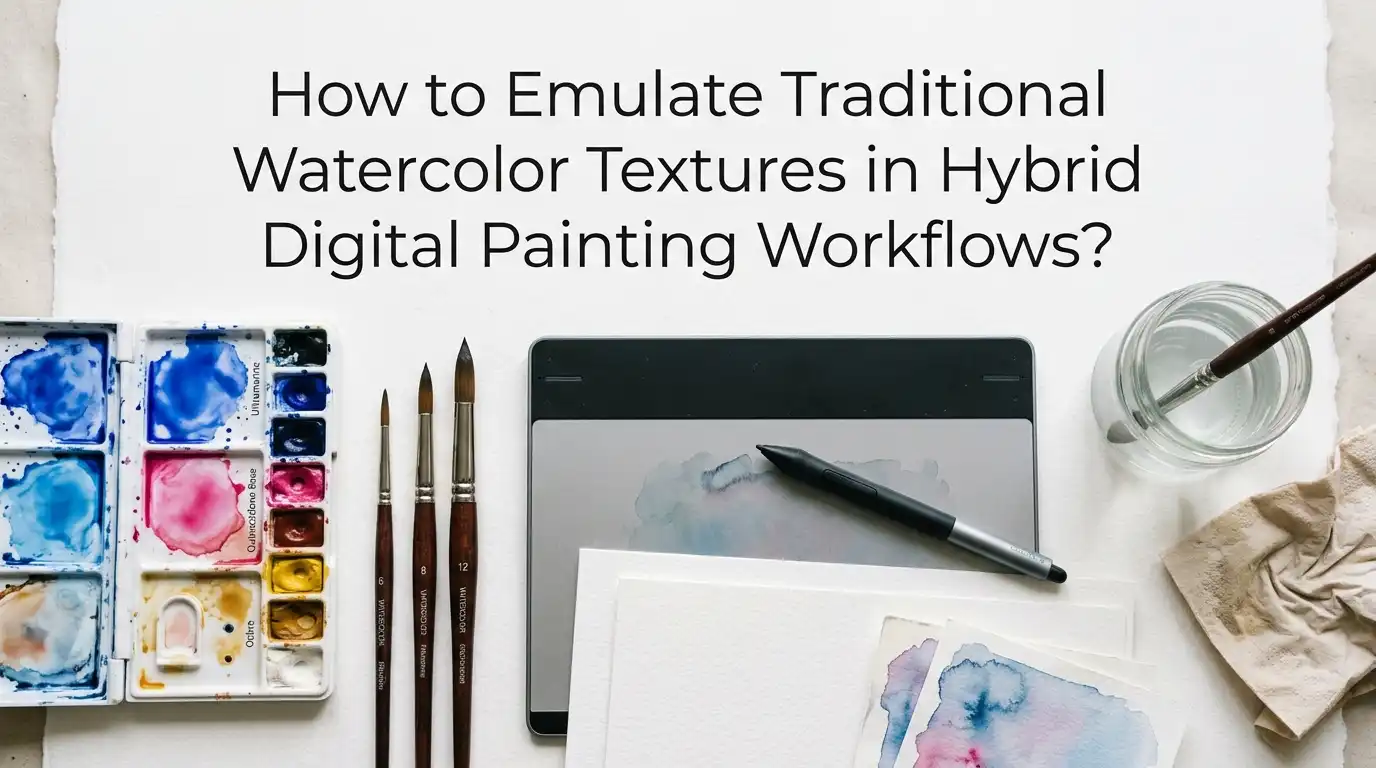
How to Emulate Traditional Watercolor Textures in Hybrid Digital Painting Workflows?
Watercolor has a soft, dreamy quality that many digital artists chase but rarely catch. The soft bleeds, the granulated pigment, the paper grain peeking through pale washes, these details give traditional paintings their soul. Digital tools alone often produce flat, plasticky results that feel artificial.
The good news is you can blend traditional and digital techniques to keep the charm of real watercolor while enjoying the freedom of digital editing.
This guide walks you through every step of a hybrid workflow. You will learn how to scan real textures, build custom brushes, layer paper grain, and fake natural bleeds. Each section gives clear, practical advice you can use today.
Key Takeaways
- Scan real watercolor textures at 600 DPI and save them as high resolution files. Real paper grain always beats synthetic noise filters because it carries tiny imperfections digital filters cannot copy.
- Use Multiply or Linear Burn blend modes to layer paper textures over your art. This keeps the paper white while letting pigment areas absorb the grain naturally.
- Build custom brushes from your own pigment scans. A single scanned wash can become dozens of stamp brushes, edge brushes, and bleed textures that match your personal style.
- Combine wet on wet and wet on dry techniques digitally by using low opacity layers with high flow. Slow, soft passes mimic pigment soaking into wet paper far better than single hard strokes.
- Always rotate and rescan your textures at 180 degrees to remove scanner glare and capture true paper depth. This trick comes straight from professional illustrators.
- Keep your color palette limited to three or four pigments per painting. Traditional watercolorists rarely use more, and digital art looks more authentic when you follow the same rule.
Why Digital Watercolor Often Looks Fake
Most digital watercolor attempts fail because the software treats paint like a flat color fill. Traditional watercolor never sits flat on paper. It pools, sinks, dries unevenly, and reacts with the paper fiber. Digital brushes often skip these steps entirely.
The biggest giveaway is the missing edge variation. Real watercolor edges show hard pigment lines where water dries, called blooms. Default digital brushes give clean, soft edges that look like airbrush work instead. Texture absence is the second big problem. Without paper grain breaking up the color, washes look like solid blobs.
A hybrid workflow fixes both issues. By bringing in real scanned material, you reintroduce the natural randomness that makes watercolor feel alive. The digital side then gives you control, undo buttons, and color flexibility.
Setting Up Your Hybrid Workspace
A good hybrid workflow needs both physical and digital tools ready to use. On the physical side, you need a flatbed scanner that handles 600 DPI or higher, basic watercolor paper, a small pigment set, and a few round brushes. You do not need expensive supplies. Student grade materials work fine for making texture sources.
On the digital side, Procreate, Photoshop, Clip Studio Paint, or Krita all support the techniques in this guide. Pick the one you already know best. Set your canvas at 300 DPI minimum if you plan to print, and 150 DPI if your work is web only.
Pros of this setup: low entry cost, total creative control, and reusable assets.
Cons: takes time to build a personal texture library, and scanning adds a slow step to your process.
Step One: Painting Real Watercolor Textures for Scanning
Start by making a sheet of pure texture studies. Take a piece of cold press watercolor paper and paint several large washes in different colors. Try flat washes, graded washes, wet on wet bleeds, dry brush strokes, and salt textures. Each one becomes a digital asset later.
Let the paper dry completely before scanning. Wet pigment shifts color as it dries, and scanning early gives you the wrong tone. A full air dry takes thirty to sixty minutes depending on humidity and how thick your paint is.
Make at least three sheets so you have variety. Label each one with the technique used. This step takes one afternoon and gives you texture material you will reuse for years. Think of it as an investment in your digital toolkit.
Step Two: Scanning Textures the Right Way
Scan each sheet at 600 DPI in full color. Save the files as PNG or TIFF to avoid JPEG compression damage. Compression smears the fine grain detail you worked hard to capture.
A clever trick used by professional illustrators is the double scan method. Scan your paper once in normal position, then rotate it 180 degrees and scan again. Layer the second scan on top, flip it back upright, and blend at 50 percent opacity. This cancels out scanner light glare and gives a flatter, more even texture.
After scanning, crop tightly and adjust levels so the white paper reads pure white. Save each texture twice, once as the raw scan and once as a cleaned version. The raw scan keeps natural color shifts you may want later.
Step Three: Building Custom Watercolor Brushes
Custom brushes built from your own scans look better than any preset pack. To make one, isolate a small piece of pigment texture in your scan. Convert it to grayscale, increase contrast, and save as a brush stamp. Your software will use the dark areas as paint and ignore the white.
In Procreate, drag the image into the brush studio under Shape Source. In Photoshop, use Edit then Define Brush Preset. Set spacing low for smooth strokes and high for stamped textures.
Pros of custom brushes: unique personal style, perfect match with your scanned textures, and unlimited variations.
Cons: brush building has a learning curve, and poorly made brushes can slow your software down. Test each brush on a sample canvas before committing to it.
Step Four: Layering Paper Texture Over Digital Art
Paper texture is the single biggest factor in selling the watercolor look. Place a high resolution paper scan on top of your finished painting as a new layer. Set the blend mode to Multiply or Linear Burn and reduce opacity to around 20 to 40 percent.
For more control, duplicate the texture layer. Set one copy to Multiply and another to Overlay at low opacity. This combination adds both shadow detail and highlight grain in one move. Mask out areas where you want clean whites to show.
If the texture looks too repeating, scale it up or rotate it. Large textures hide their pattern better than small tiled ones. Avoid stretching the texture too far, since pixelation kills the realistic feel you worked to achieve.
Step Five: Faking Natural Bleeds and Blooms
Bleeds happen when wet paint flows into wet paper. To copy this digitally, use a soft round brush with low opacity, then paint with a wet edge brush over the same area. In Procreate, the Wet Mix slider lets you simulate pigment pushing water around. In Photoshop, use the Mixer Brush tool with high wetness.
For blooms, those crispy dried edges, use a small textured brush with hard edges and dab it around the wet area. Lower the flow to about 30 percent so the marks build slowly.
Pros of this approach: flexible, undoable, and works on any digital canvas.
Cons: takes practice to look natural, and rushing the layering process produces obvious digital marks. Slow, patient brushwork pays off here.
Step Six: Adding Granulation and Pigment Separation
Granulation is the speckled effect that happens when heavy pigments settle into paper texture. Cobalt, ultramarine, and burnt sienna all granulate in real life. To copy this digitally, take a scanned granulated wash and use it as a clipping mask over your color areas.
Another method is to apply a noise filter, then blur it slightly, and set it to Overlay at low opacity. This works in a pinch but lacks the natural irregularity of real pigment. Scanned granulation always looks better because it carries the random pattern of real pigment particles.
You can also make a granulation brush by photographing dried pigment up close. Stamp it lightly over your washes in areas where shadows naturally collect. Keep the effect subtle, since too much granulation looks dirty.
Step Seven: Controlling Edges Like Traditional Painters
Watercolor edges fall into three types: hard, soft, and lost. Hard edges form where wet paint meets dry paper. Soft edges appear where wet meets wet. Lost edges blend into surrounding washes and almost disappear.
A flat digital painting often shows only one edge type, usually soft. To add variety, use a small textured brush to sharpen some borders. Use a smudge tool with a watercolor brush shape to soften others. Erase parts of edges completely for lost transitions.
Edge work is what separates beginner watercolor art from professional looking pieces. Spend extra time on this step. Even five minutes of edge variation can change a flat digital piece into something that reads as traditional watercolor.
Step Eight: Color Mixing Like a Watercolorist
Traditional watercolor uses transparent layers that mix optically on paper. Digital painting often uses opaque color picking, which kills the natural color depth. To fix this, paint on separate layers set to Multiply. Each color layer will darken and blend with the layers below, just like glazing in real watercolor.
Start with light washes and slowly build darker tones. Resist the urge to pick mid tones from the canvas. Mixing colors through layered washes gives a richer, more luminous result than direct color selection.
Stick to a limited palette of three to five colors. Real watercolorists work this way because mixing too many pigments creates muddy results. The same rule applies digitally and helps your work feel cohesive and authentic.
Step Nine: Mixing Hand Painted and Digital Elements
The most convincing hybrid pieces combine real and digital painting in one image. Paint your main subject traditionally, scan it, then add backgrounds, details, or text digitally. This approach gives you authentic watercolor charm where it matters most and digital flexibility for the rest.
You can also do the reverse. Paint digitally, print on watercolor paper using an inkjet printer, then add real water and pigment on top. The printed ink reacts with water and creates surprising organic effects.
Pros: the most realistic results possible, since real paint is real paint.
Cons: requires both physical and digital skill, and mistakes in either medium affect the final piece. Practice each side before combining them.
Step Ten: Final Color Correction and Polish
After all your texture work, your painting may look slightly dull or muddy. This is normal. Use a Curves or Levels adjustment layer to brighten whites and deepen darks. A gentle S curve adds contrast without flattening your soft transitions.
Boost saturation slightly, around 5 to 10 percent. Real watercolor pigments are more vibrant than scans often show. Adding a very subtle warm tone through a Color Balance layer makes the piece feel like it sat on aged paper.
Finish with one final paper texture pass at low opacity. This unifies all the layers and hides any digital edges that may have crept in during the painting process. Save your final file as both a layered master and a flattened export version.
Common Mistakes to Avoid
Many artists overuse texture layers and end up with muddy, busy paintings. Texture should support the art, not overwhelm it. Keep paper grain visible but never dominant in your final piece.
Another common mistake is using only one texture across the whole canvas. Real paintings show different textures in different areas based on water flow and pigment density. Use at least three different texture sources for a natural result.
Finally, do not skip the planning stage. Traditional watercolorists plan their painting before touching paper because corrections are hard. Bring this discipline to your hybrid work. Sketch first, plan your values, and decide where whites will stay. Good planning prevents endless digital fixes later.
FAQs
How long does it take to build a personal watercolor texture library?
Most artists can build a starter library in one weekend. Spend a Saturday painting texture sheets and a Sunday scanning and organizing them. You will keep adding to it over years, but even ten good textures give you enough to start producing convincing hybrid art.
Can I use this workflow on an iPad without a desktop computer?
Yes. Procreate handles every step described in this guide. You can import scanned textures through cloud storage, build custom brushes inside the app, and export finished work. The only desktop dependent step is the initial scanning, which still needs a flatbed scanner.
Do I need expensive watercolor supplies to make good textures?
No. Student grade paints and basic cold press paper produce excellent scan material. The scanner captures the texture pattern, not the paint quality. Save your budget for a good scanner instead, since scan quality affects every future project.
Why do my digital paper textures look repeating and obvious?
This usually means your texture file is too small or you scaled it up too much. Always scan at 600 DPI and use the full image at actual size. Rotating and offsetting tiled textures also breaks up obvious patterns and makes them feel natural.
Can I sell artwork made with hybrid watercolor techniques?
Absolutely. Hybrid watercolor art sells well as prints, book illustrations, greeting cards, and digital downloads. Make sure any brushes or textures you use are either made by you or licensed for commercial work. Your own scanned textures are always safe to sell.
Hi, I’m Zoe Ward, the creator and voice behind Fine Brush Vault. I’m passionate about art, painting, and exploring the world of colors. I spend my time testing and reviewing art supplies to help fellow creators find the best tools for their craft. Through honest reviews and detailed guides, my goal is to make your creative journey easier and more inspiring.